Eco-friendly Paint Trends
Planning a full house renovation or simple room refresh? If so, paint will play an important role. As a backdrop to artwork and other features that bring vitality and visual interest, paint has the power to transform an interior design project from humdrum to fabulous. It can also be a great conversation point for guests. That said, not all paint is equal and paint quality, colour, finish (e.g. flat, matte, gloss) and its simple or creative application will have a huge impact on the final look. Eco-friendly paint that’s non-toxic and made with minimal environmental impact will also help you enjoy a healthier, more sustainable home.
We asked our favourite eco-friendly paint suppliers for a little insight into current paint trends. Here’s what they said.
Little Greene
Ruth Mottershead, Creative Director at Little Greene
“It has been fascinating to see how customers have embraced colour and pattern over the past few years, with many recognising the importance of both time spent in the natural world and how transforming the home environment can lift our mood and have a positive effect on how we feel.
With ‘Forest’, we wanted to provide inspiration and ideas, for embracing these green shades in every room. No matter where or which style of property, there is a way to incorporate this rich and varied woodland palette of colours and papers, changing the atmosphere of any room to create tranquil, positive spaces that make us feel nurtured, harnessing the calming effects of nature indoors.
Our ‘Forest’ images show how to team leaf prints and woodland inspired wallpapers with the Little Greene palette, to create characterful and impactful spaces. These design schemes aim to bring the freshness of the beautiful outdoors into your home, offering a change of visual scenery, and an oasis of green to soothe and calm the mind.”
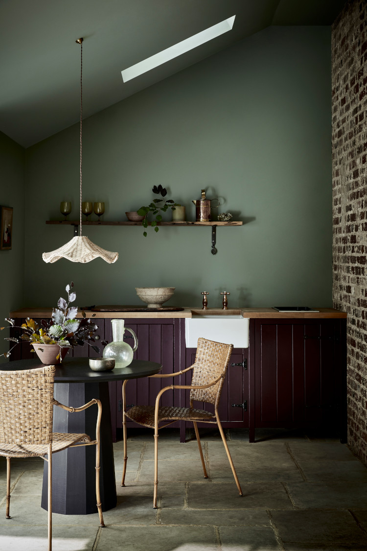
“Green is a wonderful shade to embrace in any space, from bedrooms to bathrooms or kitchens, green shades work beautifully in every room, whatever its style. Adding green to your interior will change the atmosphere creating a restful, positive space that will feel nurturing, harnessing the calming effects of nature indoors,“ says Ruth.
Paint & Paper Library
Andy Greenall, Creative Director at Paint & Paper Library
“Both consumers and designers are turning to colour combinations that add drama and intrigue to a space, from neutrals in graduating shades which flow between rooms, to more dramatic colour pairings.
Our Architectural Colours palette has been created to be used both singularly and in combination to create bold interiors. This allows for the use of layers of colour to emphasise architectural features, or emulate them where they lack, using thoughtful paint combinations. Provided in varying strengths of the same pigment, combining subtle nuances of one shade will create a tranquil harmonious atmosphere, whilst pairing the deepest hue with the palest will deliver an impactful, tonal scheme.
‘Powder V’ is the most intense hue which can be used to highlight architectural detailing on a ceiling and cornicing. It will create impact but remain elegant and harmonious when paired with the softer hues of ‘Powder III’ on walls and the lightest hue, ‘Powder I’, on skirting and woodwork.”
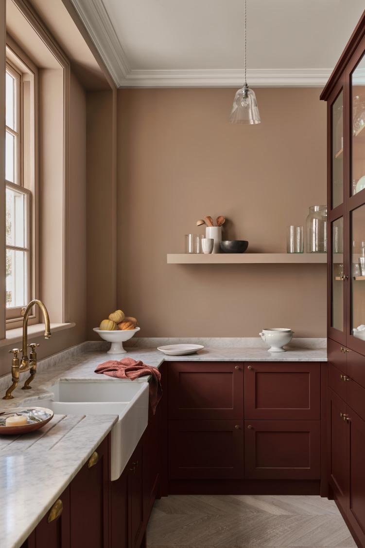
Moving away from impersonal and stark bright whites, kitchen design schemes are becoming more considered, with schemes reflecting the wider interior aesthetic of a home. Richer, mood-setting colours are being used to great effect in combination across woodwork, cabinetry and walls,” says Andy.
Farrow & Ball
Joa Studholme, Colour Curator at Farrow & Ball
“There is something inherently human in the colours that we are attracted to for 2022, as well as in the way we use them.
Décor is moving forward while drawing inspiration from the modest character of the world of folk and craft, using five significant shades that extol the virtues of a simple life and can be used in any combination and in any room.
They are an eclectic mix of the pure and the humble that evokes the warmth and harmony of a more innocent age while celebrating life today. Function goes hand in hand with ornament, using colours and finishes in unusual ways to celebrate the principles of utility, kindness and honesty.”
As of September, Farrow & Ball added to their palette with 11 new colours inspired by moments of joy, comfort and refreshment. These range from a lively, flame red (Bamboozle) to Templeton Pink, a neutral inspired by Winston Churchill’s one-time mansion (Templeton House). Warm, welcoming pinks suit both traditional and contemporary settings, and work especially well in low light where they gain added depth and drama.
Eco-friendly paint is just one part of making a home more sustainable. Alongside our vegan interior design approach Studio Hooton prides itself on delivering a home both you and the planet will love. If you’re planning a home renovation then contact us to see how we can help with your project.
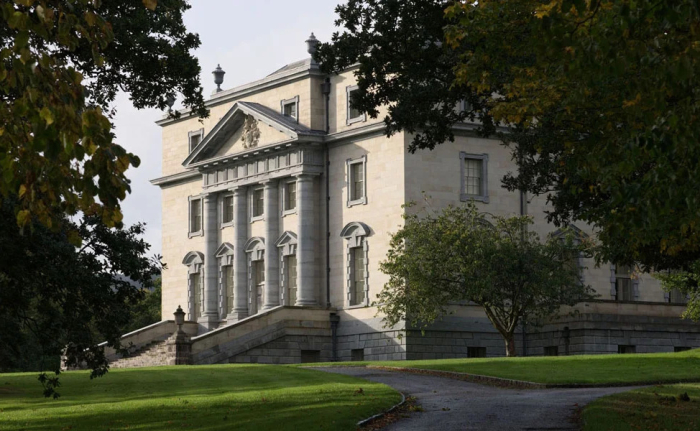
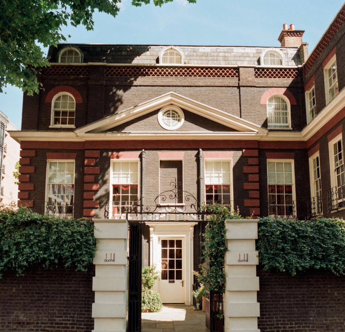
Image credits: Main image by Paint & Paper | First image by Little Greene | Second image by Paint & Paper